
These are the two ideas for my advert:

I now need to get some feedback from the people in my class and find out which of them they prefer.
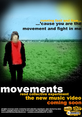
Feedback:
The feedback from my posters was quite mixed. I think that generally the bottom one was the most popular of the two as people seemed to think that although the picture on the top was maybe the best it did look a bit childish. They like the way that the bottom one left you guessing a bit more and the empty field kind of gave a bit more of an impression. It was more organic. I like this too in the way that the official album is called the Organic Family Hymnal. So therefore this bottom one will become my advert.
I prefer the bottom poster as i particularly like the brightness of the sky compared to the dull brownish bottom. Also the contrast of the leaves against the sky looks really professional. The general feel of the poster looks more professional than the top one.
ReplyDeleteI like the both however I believe that the bottom one is more effective as its clear and more contrasting towards the audience. The top one is also effective but its almost to blurry, but this is just my opinion. The only thing I would really criticise is the 'running fast and free' written in the orange as you can not read it very well due to the picture effect. Overall I like them both but think the bottom one is more eye catching towards the audience due to its simplicity.
ReplyDeleteOverall both are really good Adam, although I prefer the second. Although it is not as bright and doesn't stand out as much, I think it plainer which brings out the words more, but is still interesting to look at. I also think that the second has a more mature styling to it that I like I like, whereas the first looks more relevant to a younger audience. I also like the use, font and colour of the text as it really stands out from the picture.
ReplyDelete