Showing posts with label Posters. Show all posts

Friday, 18 February 2011

Magazine Advert Ideas

These are the two ideas for my advert:


I now need to get some feedback from the people in my class and find out which of them they prefer.
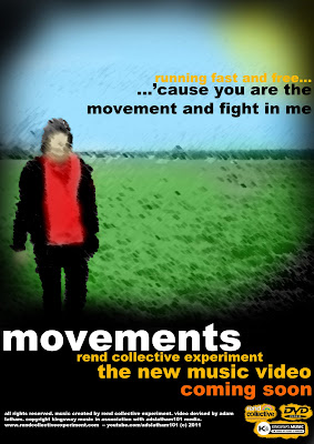
Feedback:
The feedback from my posters was quite mixed. I think that generally the bottom one was the most popular of the two as people seemed to think that although the picture on the top was maybe the best it did look a bit childish. They like the way that the bottom one left you guessing a bit more and the empty field kind of gave a bit more of an impression. It was more organic. I like this too in the way that the official album is called the Organic Family Hymnal. So therefore this bottom one will become my advert.

Magazine Poster Research

So to create my own magazine advert I looked into some other real ones. Here are some examples:


From what I can see from these adverts none of these actually seem to tell you much about what they are offering in terms of the music and the things that are included with that. So for this reason my poster is going to try and do the same thing. It will probably include a picture from the digipak. I am thinking that I will just use the picture of the field empty and then add some text that kind of teases them into looking into it. On the digipak I've added lyrics of the song so I may do this on poster too. I want to try and get people to look into the music video but not give so much away that they immediately dismiss it. This is what I will work on.

Tuesday, 1 February 2011

So now....


So now that the editing is all done I need to turn my attention to the digipak, evaluation and magazine advertisement for the video. I have been experimenting with several different ideas for the digipak. I think the road I am going to go down is the kind of coal drawn style that you can see on here:

I will do this with some of the other photos from the day that I got. I think this fits well with the way I want to represent the song because the it gives the impression that the sun is shining down on this one. When I take the picture of the people with the placards I will drain most of the colour of of all of them except for the one holding the 'God' placard. This will give the impression of God being the light of the world etc. I think the drawn style also works well in the way that it isn't really about the person that is within the picture but about the journey that is going on within the video.

Friday, 28 January 2011

Movements Cover


I think this is one of my final ideas for the cover. I will post this on facebook and see what people think of it later.

If people like this then I will maybe try and do all the internal pictures in this style too

Wednesday, 10 November 2010

Digipak Idea


This is the kind of thing that I maybe want to produce. I created this picture using several different photos so it does look a bit weird but I will actually try and set up this picture while we are filming and then take a general picture maybe using a slow shutter speed so that there is a bit of a blur on the person running.