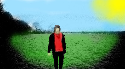
I will do this with some of the other photos from the day that I got. I think this fits well with the way I want to represent the song because the it gives the impression that the sun is shining down on this one. When I take the picture of the people with the placards I will drain most of the colour of of all of them except for the one holding the 'God' placard. This will give the impression of God being the light of the world etc. I think the drawn style also works well in the way that it isn't really about the person that is within the picture but about the journey that is going on within the video.

No comments:
Post a Comment