Saturday, 27 August 2011
Monday, 15 August 2011
After the course...
OK so I can imagine that nothing else will be happening on this blog for some time... if ever... but I wanted to tell you about one new and exciting development that may help take my music video to the next level. A new version of Adobe After Effects came out not too long ago and attached to that software is something called a warp stabiliser which, as I have seen on Youtube, has done incredible things to make shaky footage look perfectly smooth! Here is one example:
So I have just downloaded a trial version of the software so that I can have a play around with the warp stabilizer to find out whether this will make my film even better because most of the negative feedback that I received from the people that watched the film had something to do with it being too shaky that made it hard to watch so hopefully with this new development in technology and in my understanding of the software I can correct this problem that I had. If this works well then I will seriously consider getting a full version when I get to uni for me to use in my studies there.
I will not be leaving media behind because I am going to hopefully be studying media technology at either Kent or Bradford University next year and results are only 3 days away! ARGGH! It's really scary. I hope that this blog has helped to get me there and prove I have what it takes to do this for the rest of my life. I'm very excited for what the future holds.
If this stabilisation works I will post the video at a later date
Friday, 8 April 2011
Evaluation
So after much editing and processing and forgetting to upload it to Youtube and then it spending 2 hours doing so... The evaluation is finally done signalling the end of coursework. Thanks to everyone who has helped out over the past year and made this a very successful project.
Tuesday, 8 March 2011
Friday, 18 February 2011
Evaluation
So now there is now only one thing left to do. The evaluation. I will do this by making a 'DVD extra' as such. I did a load of behind the scenes recording while we were on location and then I can do some interviews with myself and also some of the people involved like the main character. I will then put these all together to make the video. These are the questions I need to address:
- In what ways does your media product use, develop or challenge forms and conventions of real media products?
- How effective is the combination of your main product and ancillary texts?
- What have you learned from your audience feedback?
- How did you use media technologies in the construction and research, planning and evaluation stages?
I will need to answer these questions if I want to do the evaluation properly. I will be the one that will be talking more about the evaluation questions although I will try and get some others to talk about a bit about it.
Magazine Advert Ideas
These are the two ideas for my advert:
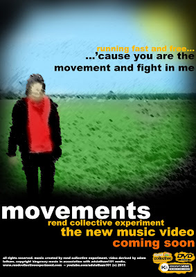
I now need to get some feedback from the people in my class and find out which of them they prefer.
Feedback:
The feedback from my posters was quite mixed. I think that generally the bottom one was the most popular of the two as people seemed to think that although the picture on the top was maybe the best it did look a bit childish. They like the way that the bottom one left you guessing a bit more and the empty field kind of gave a bit more of an impression. It was more organic. I like this too in the way that the official album is called the Organic Family Hymnal. So therefore this bottom one will become my advert.
Magazine Poster Research
So to create my own magazine advert I looked into some other real ones. Here are some examples:
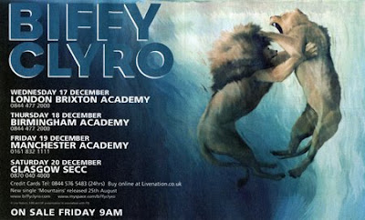
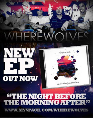
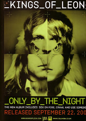
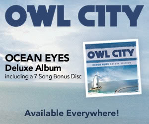
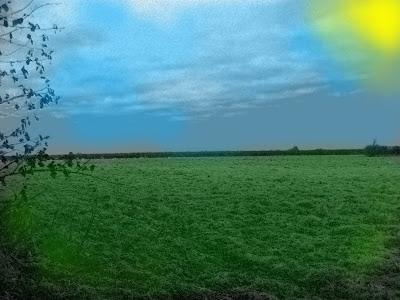
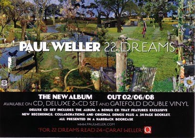 From what I can see from these adverts none of these actually seem to tell you much about what they are offering in terms of the music and the things that are included with that. So for this reason my poster is going to try and do the same thing. It will probably include a picture from the digipak. I am thinking that I will just use the picture of the field empty and then add some text that kind of teases them into looking into it. On the digipak I've added lyrics of the song so I may do this on poster too. I want to try and get people to look into the music video but not give so much away that they immediately dismiss it. This is what I will work on.
Tuesday, 15 February 2011
Digipak Pictures
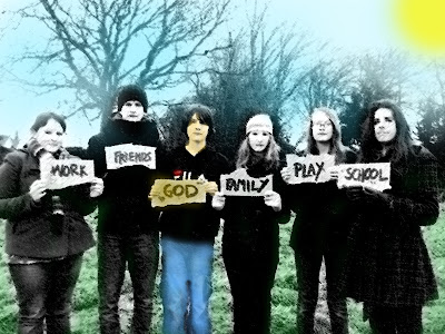
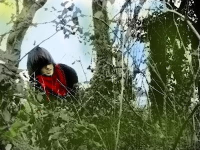

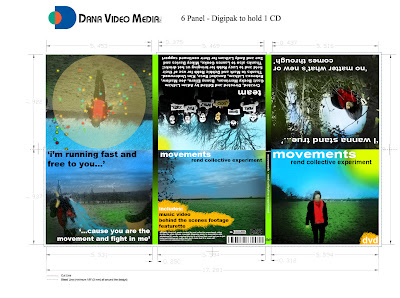
I printed off the digipak on the A4 sheet of paper in black and white to see if there were any noticeable errors on it. I will then print it out in colour to double check. I will then ask some of the people in church etc. and see what they think.
On another note, I think putting the video on youtube was a good idea because I got a comment on it from a person who I didn't know and who saw it on the rend collective's facebook page. He / she said that it was very good which is very positive!
I am now going to think about creating the poster and then I will edit together an evaluation / Behind the Scenes / Interview video over the half term.
Tuesday, 1 February 2011
So now....
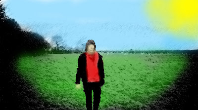
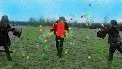
I will do this with some of the other photos from the day that I got. I think this fits well with the way I want to represent the song because the it gives the impression that the sun is shining down on this one. When I take the picture of the people with the placards I will drain most of the colour of of all of them except for the one holding the 'God' placard. This will give the impression of God being the light of the world etc. I think the drawn style also works well in the way that it isn't really about the person that is within the picture but about the journey that is going on within the video.
Friday, 28 January 2011
Movements Cover
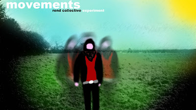
I think this is one of my final ideas for the cover. I will post this on facebook and see what people think of it later.
If people like this then I will maybe try and do all the internal pictures in this style too
Tuesday, 25 January 2011
Audience Feeback
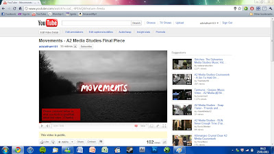
Over 4 days my video on youtube has managed to get 102 views! This means more people have watched my video already than the total number that saw last years. All thanks to Youtube and Facebook!
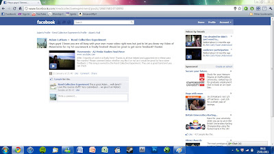
7 people liked and 9 people commented on the link that I posted on Facebook all of them were positive although whether this was because they didn't want to offend me or something like that is a different mater. All the people that commented were christian
Friday, 21 January 2011
Final Cut
My projected date was hit and here it is:
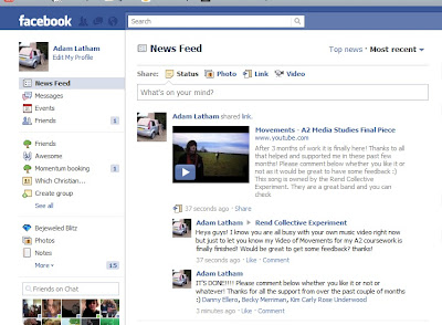
Youtube: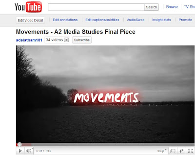
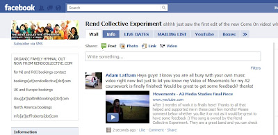
I am using the power of the internet to get feedback:
Facebook:


Wednesday, 19 January 2011
Projected completion of the final piece
I am expecting to finish the video by the end of this week! We have a double period on friday where we will be doing editing so I will finalise it there and render it out in the afternoon after I've gone home. I will then use the power of the internet to ask people to comment on it after I have put it on to youtube and send it to the band via facebook and get their opinion on it
Tuesday, 11 January 2011
Movements Second Cut
So I have listened to the comments that people have said and here is what I have done as a result. The least interesting bits have been sped up and now that I can see what is going on all in one go I can refine it to make the speed changes a bit less sudden and try and do it smoother. The painting out in the background worked very well and you can hardly see it at all unless you were looking for it! There are a few bits which just need to match the music a little better though and I fear that the video is at some points straying a bit too far away from that so I'll have to be careful
Friday, 7 January 2011
Now you see kim....
In order to get the one cut video that we wanted to achieve there was always going to be a point when someone was caught in the video that we didn't really want/need to see. There are two points which were pretty much unavoidable and these are the ones that you can see below. This first one in Kim running towards her diversion sign. When reversed obviously it looks like she is running back so I decided to paint her out as we don't want our attention drawn to the wrong thing. Here is what I did:
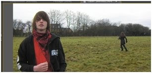
Start with the base image /\/\
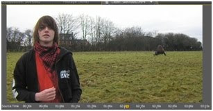
Voila! /\/\
And I also did the same for Joe underneath who was packing up the map so that it didn't fly away. He was the only one not involved in the diversion / home sequence
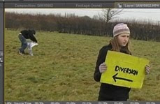
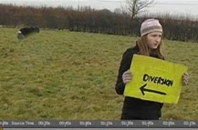
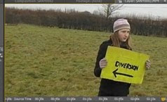
The only annoying thing about this is that you literally have to do every frame separately in order to make it work. This does work fairly nicely and is not to hard to achieve though
Feedback
I let my class see the rough cut of the video today and it seems that they were impressed! They gave me lots of constructive criticism though which is good! What I can take from what they said is that the video does take a little bit of time to get going. I can now see that they are right about this and this is something that I have taken on board and am now correcting in the edit. I am speeding up the in between bits of where not much is going on so that things are happening so that things are happening all the time and we don't lose the audience in the first minute.
The other thing I am doing to keep the song at the right time it slow down the really interesting parts. My teacher mentioned that those parts almost went a bit too fast and because I shot the video at 60fps I could slow it down and it would still be very smooth when it was slowed down. I am glad I did this because it looks so much more amazing when the water is going back in the bucket in slow motion.
So this is what I am doing at the moment and I will work more on some of the criticism as I finish each other part
Monday, 3 January 2011
First Rough Cut of the video
Done in a couple of hours towards the end of the day
Here is the first cut of the video
My only concern from looking at the video is that people may find the end a bit weird in the way that they take hands.
Otherwise I'm very happy with the way it came out
It went well!
Second time lucky!


So we got all the video footage in the bag and now it's time to begin editing! I even got some behind the scenes stuff done too!
Sunday, 2 January 2011
3rd of January! (Tomorrow!)
OK here we go second time lucky! I'm much more confident that we can do it tomorrow! I have at least 6 people coming and possibly more which is brilliant because it means that we can get this show on the road! I have everything sitting right where I left it and people know what they need to bring when they come tomorrow so we should be fine. This time it'll be from 10 - 2 so that people aren't looking too tired when they are in the video! Let's hope it all goes well!
Subscribe to:
Comments (Atom)


